iPhone apps are the hot new commodity in recent months. And the more goods apps there are, the greater the demand for the iPhone which in turn fuels more need for apps. (As noted consultant Alan Weiss says, this is an example of creating “reciprocating, exponential value.”)
With each app, a key ingredient is the logo. The “canvas” for these logos is identical and small, a little square that shows up in the iPhone menu as the sole indicator of what applications are available to choose, and as part of the listing in the iTune application store.
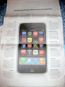
The New York Times on Sundays has been running a series of iPhone app-based ads for months. The most recent ad (below) reinforces the value of a logo that (1) identifies a brand and (2) communicates something about the brand.
Most of these logos are immediately recognizable by today’s consumer – Starbucks, CNN, facebook, Target, NY Times, Pizza Hut, Gap. There is no question what you will be getting if you use that application. A powerful message contained inside of a box the size of a thumb nail. I have heard from more than one software developer that an iPhone app name and logo that fits the small space is one of their key objectives – it may be just as important as whether the application functions are useful. Because a great application that noone knows about or uses is not very useful for the company which created it.
Lesson: The iPhone apps demonstrate that a logo can communicate a lot in a small space.


