

The NHL playoffs have begun. Of the teams competing for the Stanley Cup, who has the best logo and brand? The STANLEY CUP is a registered trademark, as is the image of the cup itself:

- Washington Capitals


- The Caps logos are great. A few years ago they had a sleeker more (ugly) modern design, which thankfully they abandoned in favor of the current logos that nod to their older logos. Positives: Red, white and blue coloring in the nation’s capital; the team name, which is rather unique; the somewhat subtle silhouette of the capitol building and the “W” within the eagle design.
- Grade: A


- Montreal Canadiens

- The logo has changed very little in 100 years of this storied franchise. The team name is unique in that it represents the whole country. The “H” in the logo stands for “hockey”. Simple, unique, distinctive.
- Grade: A-.
San Jose Sharks

- Sharks on ice? The name is fairly distinctive, but it doesn’t work for me. The logo and colors are childish.
- Grade: C-
- Colorado Avalanche
-

- The Avalanche have a distinctive name and a creative logo scheme with the wave of snow and the big foot print. The theme works for hockey in cold and mountainous Colorado. The colors are a bit to edgy for my liking.
- Grade: B.

-
- New Jersey Devils

- The name is not all that distinctive (“Sun Devils”, “Blue Devils”, etc.) but the logo is simple a good. The simplicity is also a weakness however – it is a little boring.
- Grade: C+
Philadelphia Flyers

- I like the alliteration of the “f” sound in the name. The logo design is great. It is unique and creative, and memorable. The design connotes movement and speed and the circular puck. The “flyers” name is unique.
- Grade: A-
Chicago Blackhawks

- The logo has changed little in 80 years. The team name is for a military unit that its first owner belonged to. The logo is simple and represents a long history of the team and of Native American history in Illinois.
- Grade: B.
- Nashville Predators
- Hideous. Horrible name that says nothing about hockey or Nashville. Hideously scary logo.
- Grade: F


- Buffalo Sabres


- I like the old Sabres logos better. This is too flashy and trendy. Sports team logos should represent a city and team that has been around for a long time and will be around for a long time to come. Succumbing to some trend in the design of the logo inevitably means that it will have to be changed within 10 years as the trend fades. The positives are uniqueness and the double-entendre of Buffalo the city and buffalo the animal.
- Grade: C+
Boston Bruins

- The Bruins name is not unique (UCLA), but the bear meaning and motif fits the hockey sport even though it doesn’t quite fit Boston. The spoked-B logo is apparently a nod to the “hub” nickname for Boston. I prefer the older bear logos better. The “hub” is probably lost on a lot of people, and it looks rather simple with no connection to hockey and reminds me of a ship captain’s wheel.
- Grade: C
Vancouver Canucks

- Logo is hideous and childish, and an attempt to be trendy. Other than the “C,” the whale jumping out of ice has little direct connection to Vancouver or Canada. However, the team name is cool and unique; Canuck is slang for Canadian.
- Grade: C-
- Los Angeles Kings

- The logo is a silver and purple crown. Colors are not very attractive. Logo really has nothing to do with LA or with hockey. Their older logos were more attractive and connected in color and style to the LA Lakers logo, as both teams were owned by Jack Kent Cooke [note, he also at one time owned the Chrysler Building – the spire of which is a registered trademark – and later owned the Washington Redskins]. Later, the Kings had silver and black styling as a nod to the (then) LA Raiders. The current logo says nothing about LA or about hockey.
- Grade: D
- Pittsburgh Penguins

- The skating penguin is pretty cool. The name is unique, is most appropriate for hockey and the black, white, and yellow color scheme matches the city’s iconic Steelers football uniforms.
- Grade B+
Ottawa Senators

- Hideous logo. Odd name but they get a pass on it since it was used for the pro hockey team in Ottawa back in the 1800’s. As Ottawa is the capital of Canada, I think the name is fairly cool, but the logo takes the name too literally and does not work for me. The logo is of a Roman general. It doesn’t look particularly intimidating to me.
- Grade: C+
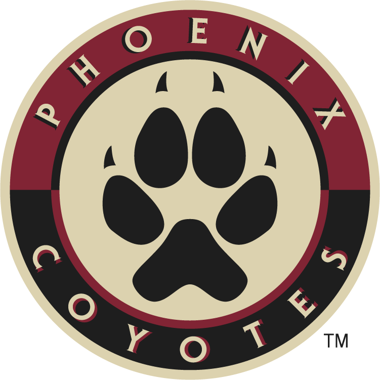
Phoenix Coyotes


- Original name and a decent logo. Ties into the desert area of Phoenix. Nothing too striking about it, but it works.
- Grade: B
Detroit Red Wings

- The Red Wings logo has remained essentially unchanged for decades. It is iconic and the wheel of course works in the “motor city” of Detroit. The name and logo do not have a lot of meaning – they were essentially copied from a team called the Winged Wheelers – but the success of the team, the simplicity and consistency of the logo make it solid.
- Grade: A


So, who has the best NHL team name and logo of the playoff team? I gave Detroit, Washington and Montreal “A” grades. Note that there are some great ones among the teams did not qualify for the playoff this year: Rangers, Islanders, Blues, Flames, and Oilers.
Overall, I give the nod to Washington — Detroit and Montreal have tradition and simple elegance — but Washington has taken a new design, modeled on a old design, and made it work in an appealing style that ties into the Washington region. Plus, the “Caps” have used “Rock the Red” to promote the team and motivate fans to come to games wearing red home jerseys. They have created a great brand, but have apparently failed to file to register and protect “Rock the Red” which is the phrase being talked about and seen on signs all around town.

What’s your favorite NHL logo? Feel free to comment!


You should really do your research before you post a blog …
http://en.wikipedia.org/wiki/First_American_Cave
Brian, thanks for shedding some light on the origin of the Predators’ logo. What do you think of their logo?