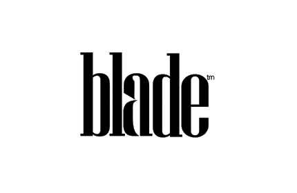
More and more logos seem to be using the whitespace to tell part of the story; sometimes obvious, sometimes more subliminal. See below for examples. The greatest whitespace use – and possibly the best logo ever in my opinion – is the FedEx logo that incorporates an arrow in the whitespace. Amaze your friends by showing them the hidden arrow in the FedEx logo, and some of the other hidden whitespace elements in the images below — like the US Capitol in the bottom of the Washington Capitals logo


Tip: A logo is an incredible opportunity to communicate something about your business to your potential customers. Doing it in a creative, playful way is memorable and eye-catching for many of the above brands.


