

Over the past 2 weeks, I have watched quite a few hours of the Olympics coverage. The competition is great. What about the London 2012 logo?
![]()
When the logo was first unveiled a few years ago, it was panned by many. It was too modern, abstract, jagged, etc.
I actually like the logo a lot. It is fresh. Unique. Bold. Young. The logo’s designers used the phrase “prescribed anarchy” to describe it. The accompanying font also fits these characteristics.

Note that the slogan for hte 2012 Game – INSPIRE A GENERATION – is terrific as well. I continues the theme of youth and modernity.
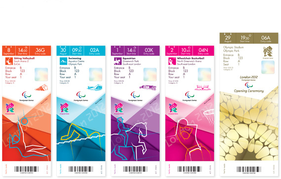
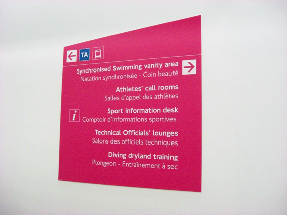
And the designs of the tickets, signs, and other items accompanying the Games continue the themes, but are not so bold that they distract from the message and purpose.
I wonder how many times per minute the logo is displayed during the telecast? The logo and the Olympic rings are plastered everywhere – on news, courts, stadiums, tracks, etc. – so the number must be quite large. Do you like the London 2012 logo? Will you remember what it looks like 4 years from now in Rio?
![]()
Additional reading: The Surprisingly Smart Strategy Behind London’s Infamous Olympic Branding
Related post: Olympic Trademarks

