

The Nets of the NBA are moving to Brooklyn next year. Jay-Z owns a small percentage of team. According to reports he helped design the new logos. I love Jay-Z’s music. I think the new logos the team recently unveiled are rather lame.
Why? They are so plain. Now, retro can be cool and these look like an attempt to be “retro” with a new team/name/logo. But they are not retro in a cool way. They are just too plain to me. [The opposite of the recent Miami Marlins logo, which is too much pizzaz.]
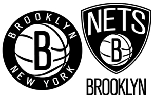
Another reason it is lame, there is no imagery in the logo that references New York or Brooklyn, which would seem to be at the core of the brand’s image. The “B” is reminiscent of the Brooklyn Dodgers old logo. But yet it is not the same.
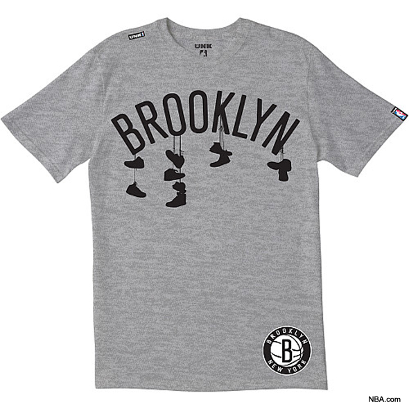
Also, the nets unveiled some merchandise and apparel that included the shirt below. The image is cool – but it references a message about drug dealers and murders. Is this really an image that a professional basketball teams wishes to associate with?
One positive thing I can say about the logo designs is that the team ownership wisely filed to register the various designs with the USPTO. In one odd filing, they are attempting to register a plain black shield for apparel:
(Application Serial No. 85605708)
For another take on the logos from a branding blog, see The Brooklyn Nets: I Call Technical Foul

