

The National Hockey League’s Dallas Stars recently unveiled a new logo.
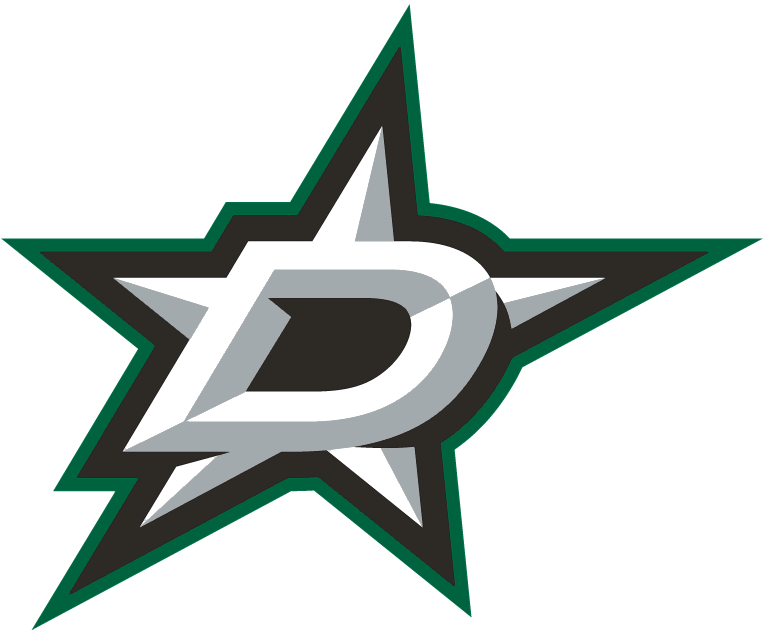
In my opinion, the logo is hideous. It is too busy. The colors are atrocious. The three dimensional look is cheesy and too flashy. The outline shape encompassing both the star and the “D” is ridiculous.
On the positive side, the team did put together a video for the launch. Green has potential – according to the Stars’ video, no other NHL team features green as its main color. And the team did file the logo in several new trademark applications with the USPTO, including this one for ice hockey services.
Perhaps you disagree? Let me know what you think.


awesome logo! go dallas go! love the toronto maple leafs to!