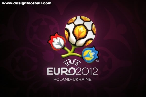
Organizations frequently re-design their logos to kickstart a new ad campaign, launch a new product or service, or communicate a new message. Here is a run down of a few recent logo changes in the news:
Great logos:

- I really like this new logo for the EURO2012 soccer championships. The touch of nature (flowers) and the incongruous way the soccer ball grows as flower yet fits the the design and motif are wonderful. The logo makes you think, is memorable, and has a message.

- The logo for the 2014 Winter Olympic games is simple and fantastic. The font is interesting, the mirror-like effect of “sochi” and “2014” is captivating. The “.ru” symbolizes the digital age which the organizers aim to incorporate into the games’ media, as well as identifying the location in Russia. And it contains the elegant simplicity of the colored Olympic rings. In short, it is simple, but conveys a message and captures the viewer’s eye and thoughts.

- The Glasgow 2014 Commonwealth Games logo capture the classic nature of the sporting games, but also features a distinctive circle and arc design around the G. The circular image is simple, yet colorful, traditional yet modern. The balance works here.

-
The government’s Recovery.gov website logo is great. It blends patriotism (stars), industry (cogs) and the environment (leaves). The divided circle is clean and fresh. It is nice to see the government cognizant of branding.
Failed logos:

- Hertz’s old logo was quite well known. They were a heavy advetiser for years. The new logo is a different font and without the shadow effect. The font more curvy and less tradition. I don’t think it is a good it and I don’t think it changes the impression of the Hertz brand in any good way.

- When Jay Leno practically alienated everyone at NBC and competing networks by going back to late night after a failed prime time stint, NBC decided it was time to refresh the logo. The only problem is that the logo is still boring and unremarkable. And Leno’s name is tiny compared to “Tonight” and “Show”. Maybe that is because someday he will be gone and the show must go on?

- Kayak’s recently updated logo, on the right, is interesting. It looks like an old fashion manual odometer face. Which today is old fashioned and no the most relevant for the internet age and Kayak’s primary use – finding flights and hotels. While the old logo maybe did not have a srong or memorable message, the new logo misses the mark for me.


