Not all logo changes are necessary. Not all logo changes are improvements. While there certainly can be value in updating an old design or changing it to better reflect the business and its message to consumers, some logo changes miss the mark. Here are few recent logo changes that were made that, in my opinion, are terrible:
- The National Reconnaissance Office unveiled a logo on a recent satellite mission featuring an octopus and the slogan “NOTHING IS BEYOND OUR REACH.” Given the US government’s recent well publicized issues with allegations concerning its spying, this slogan is rather brash and insensitive. On top of that, the octopus looks bizarre.

- The University of New Hampshire unveiled a new logo this month. It is simple. Too simple in my opinion. It says nothing about the school, about New Hampshire, about its history or its mission or its specialties. It says, were are clean and futuristic. I think it is quite bad.
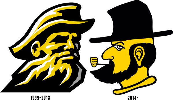
- Appalachian State made the logo change (or perhaps just an ‘alternate logo’?) below. The new logo looks a little too playful and amateur in my opinion to represent and serious school. The logo’s name – Victory Yosef – also seems rather odd.