

In no particular order, here are my favorite logos in use today, along with a brief note about each. Upon reviewing them I notice how many of them are extremely simple. Yet they convey powerful messages. There are many great logos. I’m sure I could have come up with a totally different list. But today, these are in my highest tier of logos that speak to me the most. One common theme is clean design. Another is the lack of people or figures featured in them for the most part.
Did your favorites make my the list? Share in the comments below.
-
 – A great brand name for a print (originally) publication electronics. Simple but elegant and provactive logo.
  – The name and logo suggests a lot: the huge range of items availble (biggest river on Earth), a smile/hapiness, and moving goods from one place to another.
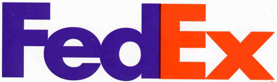 – Possibly my all time favorite. Simple. Hidden arrow between the E and X subliminaly telling consumers that they will get your package where it is going.
 – Simple and plain. One color. Plain fonts – one with a block square style, one with the a flourish. Absolute. And the star of an incredible ad campaign playing off the logo.
 – For years I never looked closely enough to notice that the squiggles spelled sun. In two directions. Amazing.
 – Simple. Iconic. Interesting font but not so wild that it detracts from the simplicity of the message and the design.
 – a great brand name for equipment with big treads or wheels that crawls slowly across the land. And the logo conjures up images of climbing a mountain or reaching the peak.
 – The Coke logos could also be the best of the best. And Coke has wisely in recent years incorporated the iconic shape of its bottle into more logos and placements on cans, boxes, and even its recyling and rewards programs logos.
 – The sole logo on my list without any words (other than the Coke bottle shape). Kids around the world instinctively attach it to Mickey Mouse and Disney. The shape is unique yet obvious to anyone who has seen the mouse. Strong enough to stand on its own, without any wording.
 – bold and fun, the logo perfectly captured the attitude of the new cable music video station when it launched
 – The stylized Golden Gate bridge suggest bridging networks and the transmission of data. The nod to the Golden Gate bridge also suggests of cisco’s name, which is derived from San Francisco.
 – Spacey. Futuristic. Creative font. It captures the themes of the Star Wars brand in a simple elegant manner.
 – Great logo for a petroleum company because it evokes a “green” and clean theme. The logo also suggests the sun, plants, and flowers, and thoughts of youth, life, clean, and regrowth.
 – fun, simple, chocolaty
Tip: A logo does not have to been terribly complicated or fancy to have a strong impact on consumers and to convey important messages to the consumer. What does your logo say about your business?

