

This week’s Big East men’s basketball tournament marks the end of the conference in its original form. Next year, the conference will be much different as several teams are leaving, and reportedly have reached a deal to take the Big East name with them. The conference began in 1979 and has provided terrific college basketball match-ups ever since.
How do the logos and names of the original Big East teams stack up? Here is my rundown [click logos and marks for USPTO records]:
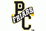
PROVIDENCE FRIARS
- Old Logo:
- Newer Logo:

- The new logo is spooky looking. And not in a good way. The old logo was simple, but was just fine. The “Friars” name is great for a Catholic school. Providence College does not appear to have any USPTO trademark registations for its brand.
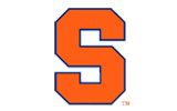
SYRACUSE ORANGE
- ORANGEMEN

- The “Orange” were, until 2004, the “Orangemen” and “Orangewomen.” The name is unique in sports, to my knowledge. It is bold and memorable. And thus I think it is great.
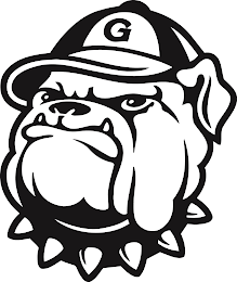
GEORGETOWN HOYAS
- HOYAS
- I just learned, from looking at these registrations, that HOYAS translates into English as “MAINTAINING VALLEY.” According to Wikpaedia, “The team name is derived from the mixed Greek and Latin chant, “Hoya Saxa,” (meaning “What Rocks”).” The name is unique. The mascot – a bulldog with a spiked collar – is tough. The name and logo and mascot are quite good.
SETON HALL
- Old Logo:

- New Logo:

- The Seton Hall logo and name is not registered. And their newer logo is a little strange looking. The old logo is great in my opinion. The “Pirates” name however is faily common.
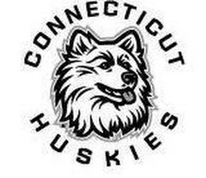
CONNECTICUT HUSKIES
- Old Logo:

- Newer Logo:
- The “Huskies” name is not unique. The mascot/logo is not that creative. The UCONN nickname is nice. But in total, the brand is a bit of a dud.
BOSTON COLLEGE
- Old Logo:

- New Logo:

- BOSTON COLLEGE EAGLES
- This is another case (see others above) where a new logo is not better than the old logo. It is a bit more modern and more sleek, but it really adds little or nothing. The BC logo is good, but nothing special, and the EAGLE name is not unique. All in all, an average brand.
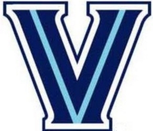
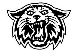
VILLANOVA (joined 1 year after the conference started)
-
- VILLANOVA WILDCATS
- Another team name, WILDCATS, that is rather common. But I like the logo and the stylized “V” is quite nice.
SUMMARY:
The “Orange” name is most unique, despite being so simple. The Syracuse mascot, Otto the Orange, is also unique and interesting. The Hoya name and logo are interesting, but the rest of the original Big East brands are rather straightforward. So from a branding and trademark perspective, I like the “Orange” far better than the rest.
Bonus reading:
A great oral history of the Big East in Washington’s City Paper

