

The online social media site Foursquare updated its logo recently. To understand the new logo, it is helpful to know that Foursquare users “check in” at locations.
The new logo is great! Especially compared with the old logo. The old logo was stale and simple and probably similar to many other logos. It consisted of a check mark.
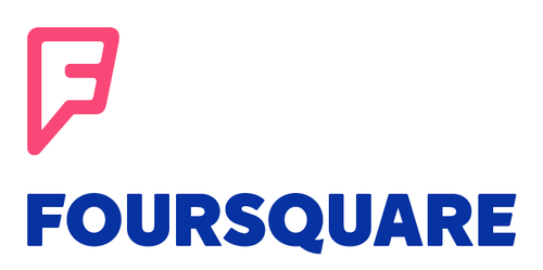
The new logo is a pointy “F.” It is simple and original and unique. The point is relevant because it can serve as a location indicator on a map — which is at the heart of Foursquare’s service.
The logo rollout was well done — accompanied by a blog post. And a USPTO trademark application.
New logo:
Old logo:
![]()

