

Yesterday, I broke down what I think are the best logos and brands in the Western Conference NBA playoff team. Now it is time for the East:
- Indiana Pacers
- Nice classic logo design.
- Interesting and unique name. Suggestive of pace car at the Indy 500 and history of harness racing.
 - A blue P outlined in silver with a yellow basketball with script")
- Atlanta Hawks
- Shortened from the Blackhawks. Has nothing to do with Atlanta area.
- The logo is nothing special. The logo in the 1970’s and 80’s was much more interesting.
 - Red and blue hawk with wings spread out holding a basketball")
- Chicago Bulls
- The name is apparently a nod to the city’s history in the meat industry, once boasting the largest stockyard in the world. It is fairly unique.
- The logo has never changed. It is classic.
 - Red bull with script above head")
- Washington Wizards
- Terrible name. Not sporting at all and not intimidating. But the newer red, white, and blue logo is far better than the old, but is still hideous. Especially the alternate DC logo and the ball featuring the Washington monument.
 - Red, white and blue wizard holding basketball with WIZARDS below in italics")
 - Wizards dc alternate logo in white on blue background")
 - Red, white and blue basketball with the Washington Monument and a silver star inside")
- Toronto Raptors
- Silly and terrible name. Silly and terrible logo.
 - A red raptor dribbling a basketball on a black circle")
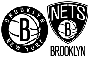
- Brooklyn Nets
- Generic basketball word, but nonetheless unique as a team name. Nice logo.
- Related post: Love it or Leave it: New Brooklyn Nets logo
- Miami Heat
- Unique name. Oddly named after weather, but it works for Miami.
- The logo is OK – the burning ball passing through the hoop. The font is a bit much, too trendy/futuristic.
 - Red basketball with flames goes through a white hoop")
- Charlotte Bobcats
- Unique name, I guess. But nothing about the name or logo really resonates with me.
 -")
Bottom line: PACERS and BULLS are far better names/logos than the competition.

